Gutenberg vs Elementor
Let’s Try Gutenberg
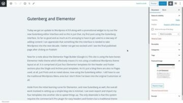
Today we got an update to WordPress 4.9.8 along with a promotional widget to try out the new Gutenberg editor interface and so this is just that, my first post using the Gutenberg interface. So far so good and as much as it’s annoying to have to get used to a new way of adding content I can appreciate that something like this interface is needed to take WordPress into the next decade. I better not get too excited until I see the final published page after clicking on Publish!
Now for a note about the Elementor Page Builder (Google it.) This site is using the bare-bones Elementor Hello theme which effectively means it’s not using a traditional WordPress theme layout at all. It comprises just four Elementor templates for the Header and Footer sections plus the Single and Archive post templates. As it’s just a blog there are also no Pages used, at all, just posts and as noted above, now using the Gutenberg editor. I still have to use the traditional WordPress Menu area, but I don’t think I’ve been into the original Customizer at all.
Aside from the initial learning curve for Elementor, and now Gutenberg as well, the overall work involved in setting up a simple blog site is minimal. I can even export and import my four templates into another site to speed things up. The only downside is that this system requires the commercial E-Pro plugin for easy headers and footers, but a traditional theme could provide headers and footers for the free version of Elementor. I really appreciate the idea of not using any real theme at all and therefor not having to be stuck with one themes idea of how the layout should look. Using E-Pro with the minimal Hello theme means I have total control of how the entire site looks using a single page builder system without having to test various themes to find one that suits me. No, just scale out a site using a single interface (or two now with Gutenberg added to the mix.)

